
Enabling real achievement
Naming and visual identity for Mannaz
The competence development company DIEU had existed for more than thirty years, during which the company worked on creating international growth. This led to an establishment of offices in Brussels, London and Berlin. Following the internationalisation of the company the name ”DIEU” created a number of challenges, one of which was that ”DIEU” means ”God” in French.
Project details
We were giving the task to develop a new company name and subsequently a new visual identity. DIEU wished for the new name and the new visual identity to reflect the company’s Scandinavian roots and long history.
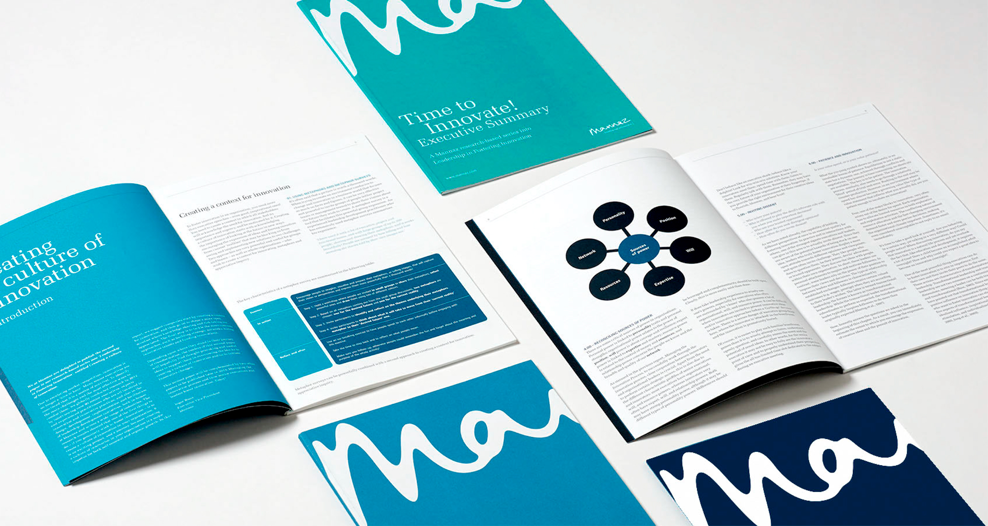
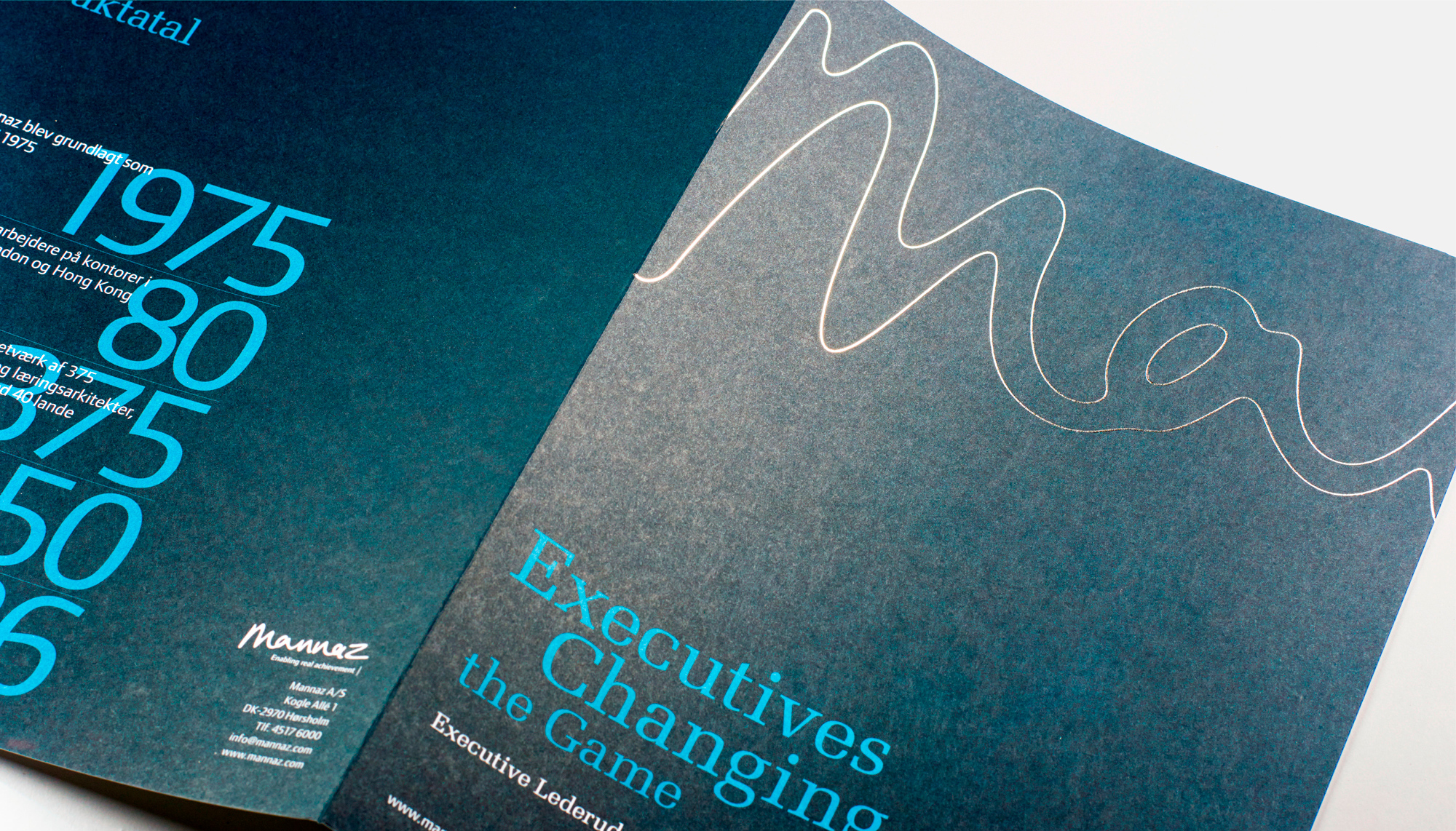
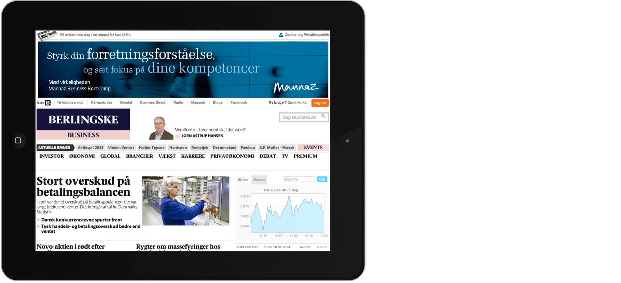
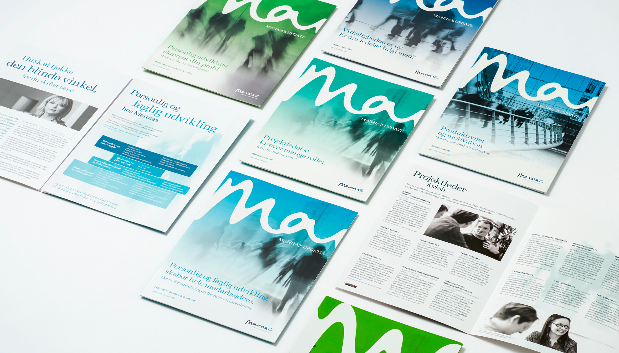
Mannaz is Proto-Germanic and means human. The logo is handwritten, which in itself carries the reference to the focal point of the company – the unique human being. The logo contains both soft and hard values due to the combination of the organic form and the cool, blue colours. It is the underlying basis of the entire identity, and an inherent, recurrent visual element in the form of the graphical structure. The style of the photos and the colour palette supports and expresses the Scandinavian roots.

Contact
Anne-Mette Højland
- CEO & founder
- am@idnagroup.com
- +45 22 20 00 64

Related work
EHF visual identity
Rejuvenating handball Brand design system and visual identity for the European Handball Federation EHF In 2019, the European Handball Federation…
Krigsmuseet – Kanonhallen
Mankind has always been both fascinated and repelled by war. War is ugly, horrible and cruel, but at the time, it is an exceptional story about human beings, the eternal struggle for power and war is an important focal point in human history. That is why we were extremely happy to be given the opportunity be a part of creating the visual universe for the new exhibition in the beautiful old artillery hall, and hereby be a part of conveying the insights and learnings about war.
NutAlone
NutAlone is a digital platform enabling the easy distribution and viewing of indie films. The platform was launched in 2019, and we helped in both the naming process and the creation of their bold new visual identity.
Netgen
Netgen wanted to establish a strong position in a market with increasing competition. In order to do so, we were asked to define their brand identity, including brand name, visual identity, tone of voice and brand website.