
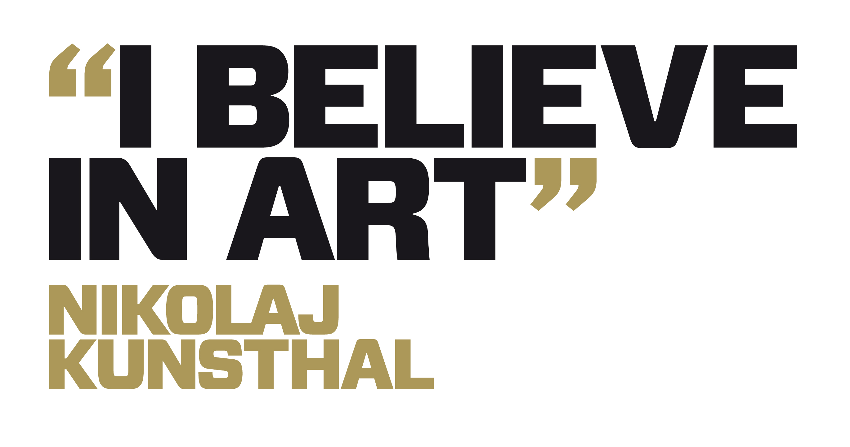
“In art we trust”
Visual identity for Nikolaj Kunsthal
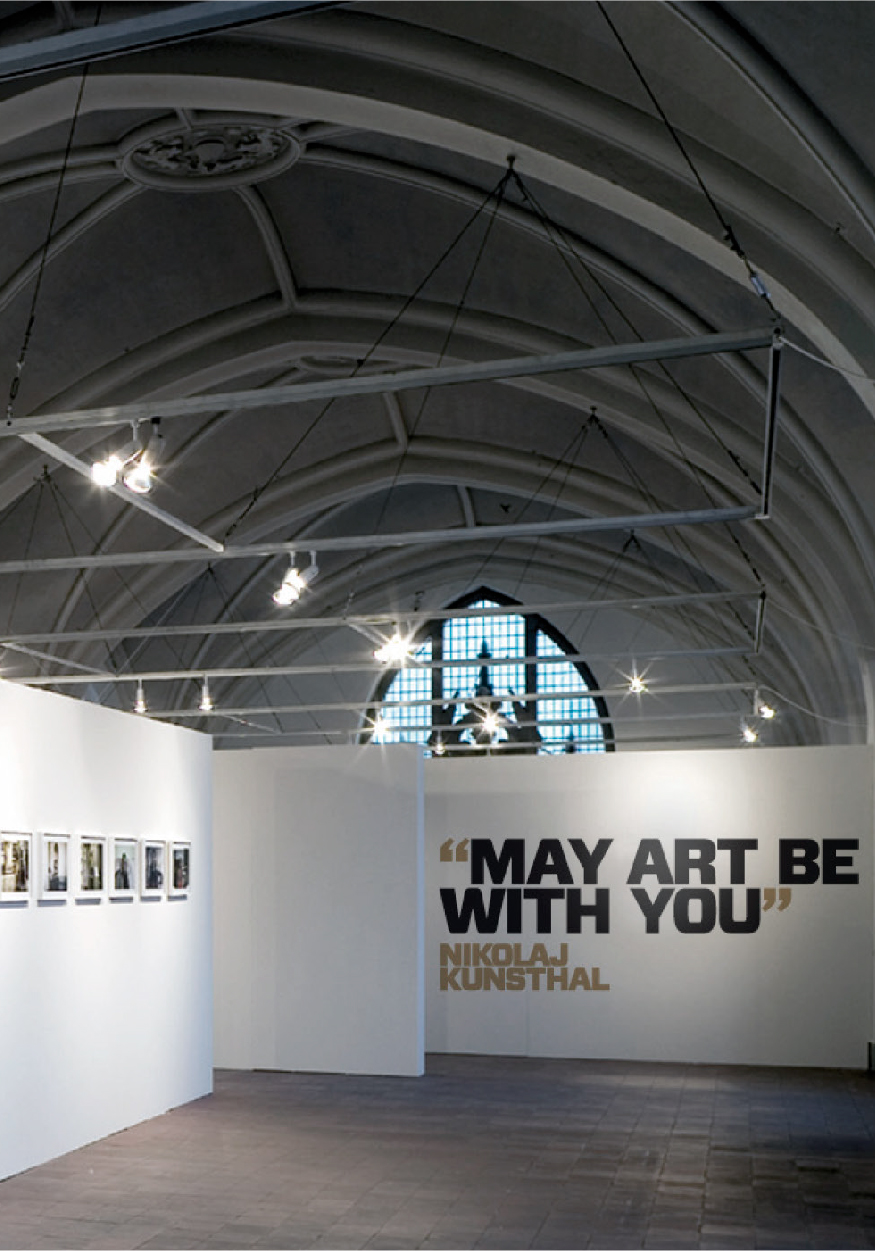
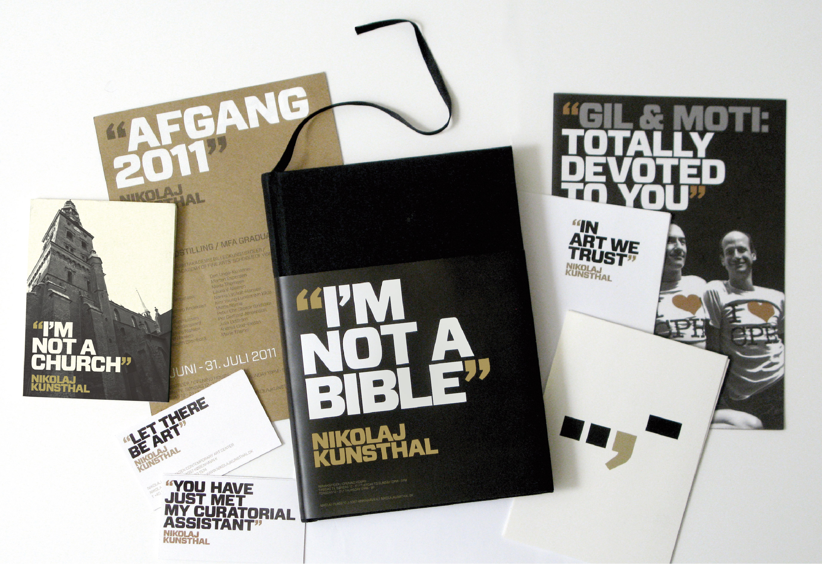
By personifying the art centre – Nikolaj – and letting it speak – “Let there be art”, Nikolaj preaches its passion for art through “Biblical” quotes. By saying, “I’m not a church” – what you see is not necessarily what you get!

Project details
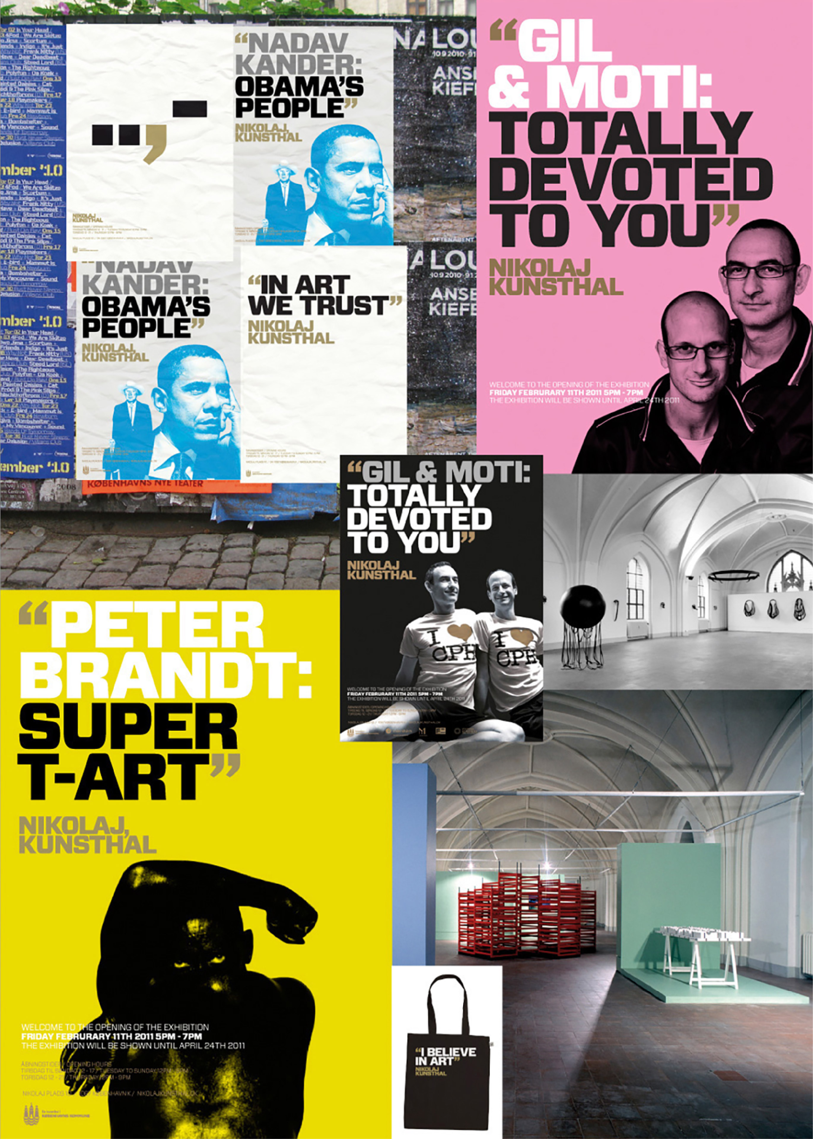
Nikolaj Kunsthal is an art centre in inner Copenhagen, located in a former church from the 12th century. The task was to create an identity, which expresses the mission of the art centre, while at the same time benefitting from the unique location of the church room. The new identity also had to ensure that the disadvantage of the location (the fact that many people pass by every day, dismissing it as a church and do not come inside) was turned into an advantage.
By personifying the art centre – Nikolaj – and letting it speak – “Let there b eart”, Nikolaj preaches its passion for art through “Biblical” quotes. By saying, “I’m not a church” – what you see is not necessarily what you get! (“Ceci n’est pas une pipe”).
Nikolaj creates curiosity and turns the art centre’ sonly disadvantage into a blessing. The stringent colour scheme of the art centre’s corporate identity (gold, black and white) ensures recognition, and allows the posters/material for individual exhibitions to stand out, while at the sametime expressing the art centre’s vision. This means that every new exhibit, no matter how different from the last, becomes a part of, and strengthens Nikolaj’s holistic identity.
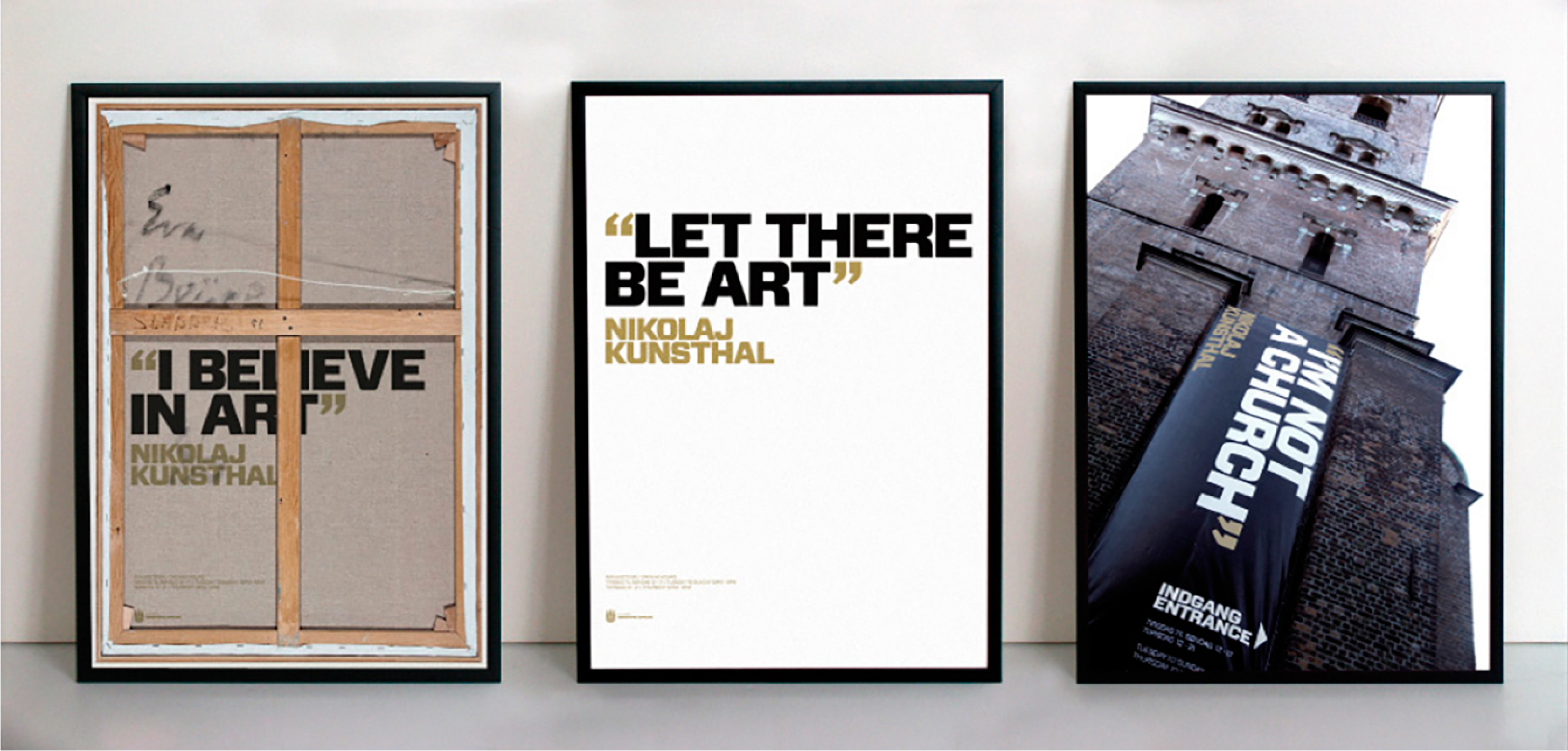
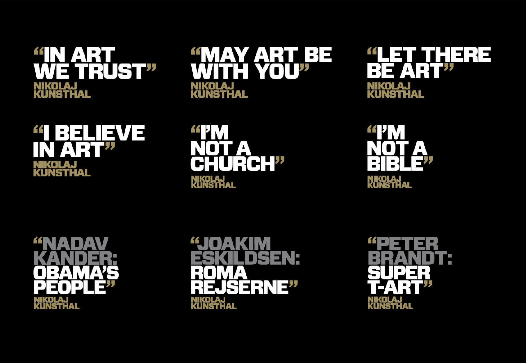
The stringent colour scheme of the art centre’s corporate identity (gold, black and white) ensures recognition, and allows the posters and material for each exhibition to stand out, while at the same time expressing the art centre’s vision.
Contact

Related work
EHF visual identity
Rejuvenating handball Brand design system and visual identity for the European Handball Federation EHF In 2019, the European Handball Federation…
Krigsmuseet – Kanonhallen
Mankind has always been both fascinated and repelled by war. War is ugly, horrible and cruel, but at the time, it is an exceptional story about human beings, the eternal struggle for power and war is an important focal point in human history. That is why we were extremely happy to be given the opportunity be a part of creating the visual universe for the new exhibition in the beautiful old artillery hall, and hereby be a part of conveying the insights and learnings about war.
NutAlone
NutAlone is a digital platform enabling the easy distribution and viewing of indie films. The platform was launched in 2019, and we helped in both the naming process and the creation of their bold new visual identity.
Netgen
Netgen wanted to establish a strong position in a market with increasing competition. In order to do so, we were asked to define their brand identity, including brand name, visual identity, tone of voice and brand website.